Product design: how to create experiences people love

DesignServices
Share close

Product design stands at the intersection of business, technology, and customer needs. We all want products that people enjoy using, are technologically viable, and ultimately help improve the company’s bottom line. Balancing all those requirements is what constitutes great product design. Let’s dive into some of the methods and practices I use in my work that allow achieving that outcome.

This article focuses on product design, but much of what is introduced here translates seamlessly into the realm of marketing. Building marketing websites presents its own unique set of challenges: from defining a value proposition to creating a user acquisition plan and optimizing for conversion. However, at its core, the process shares significant similarities with product design in terms of stages, activities, approaches, and deliverables.

Curiosity

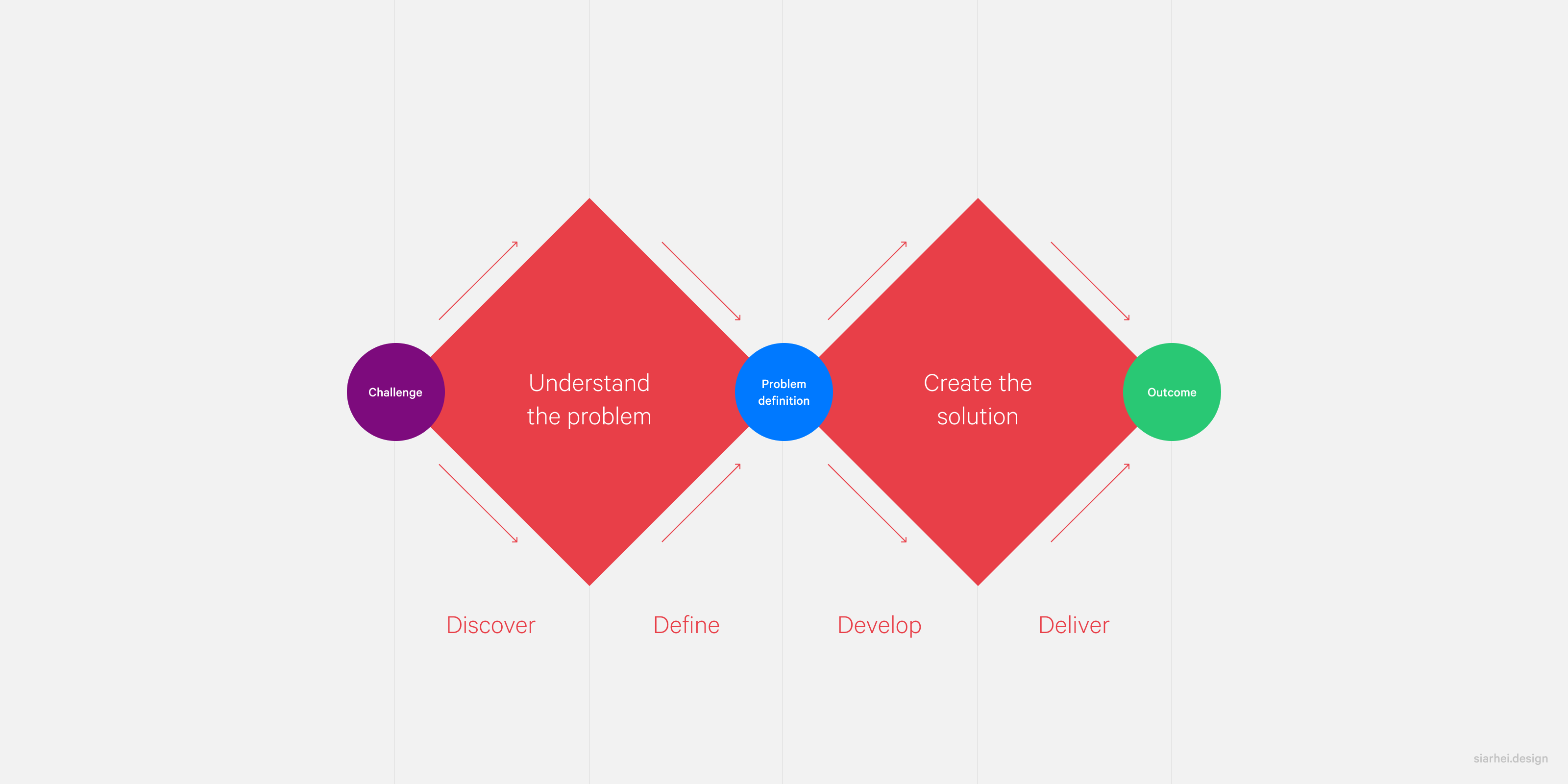
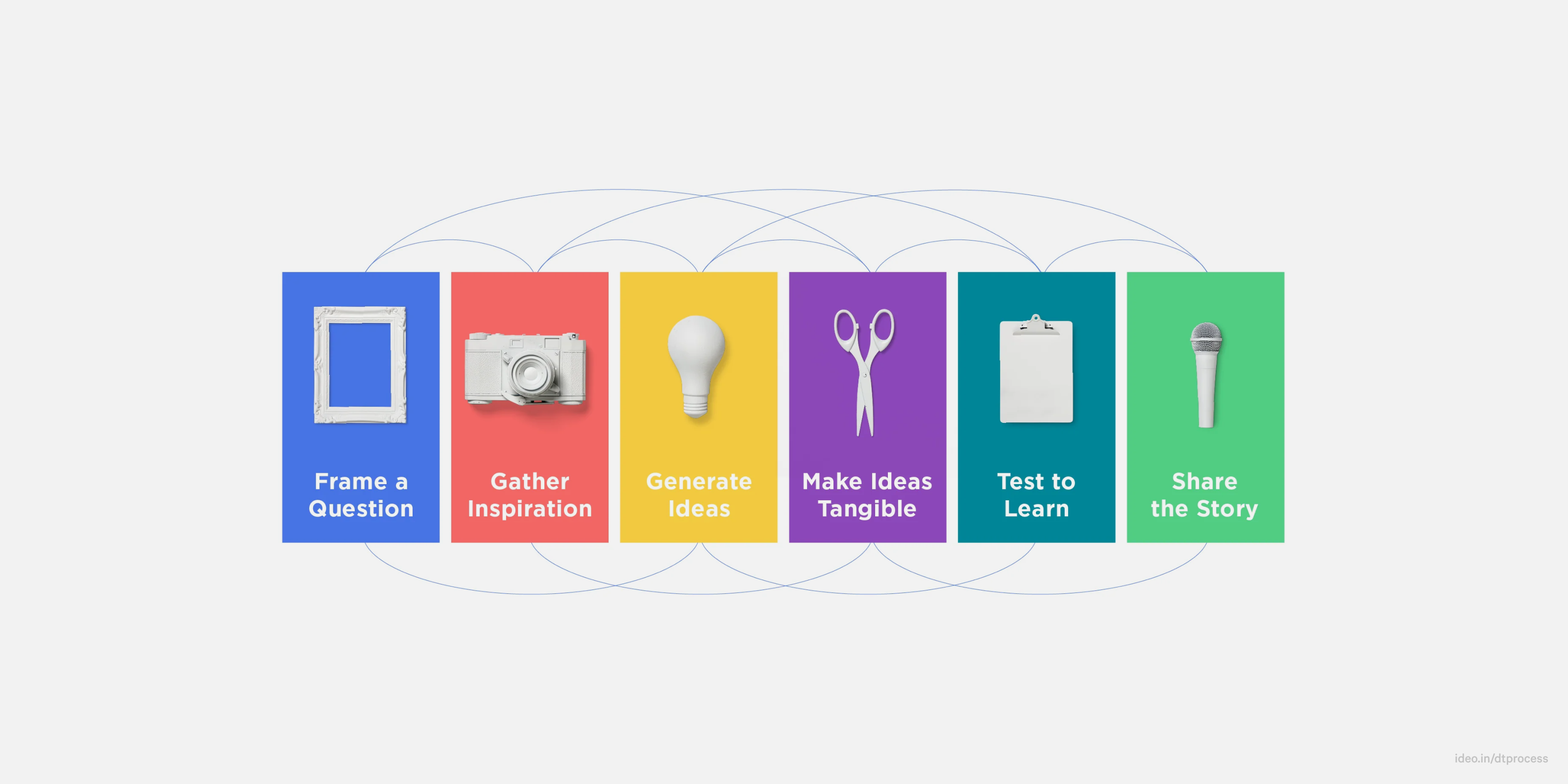
If you look at any structured method for the design process, like IDEO’s design thinking or the Double Diamond framework set by the British Design Council, you will always find a discovery stage. This part might have different names—such as framing or inspiration gathering—but it is a consistent and important part of these approaches.

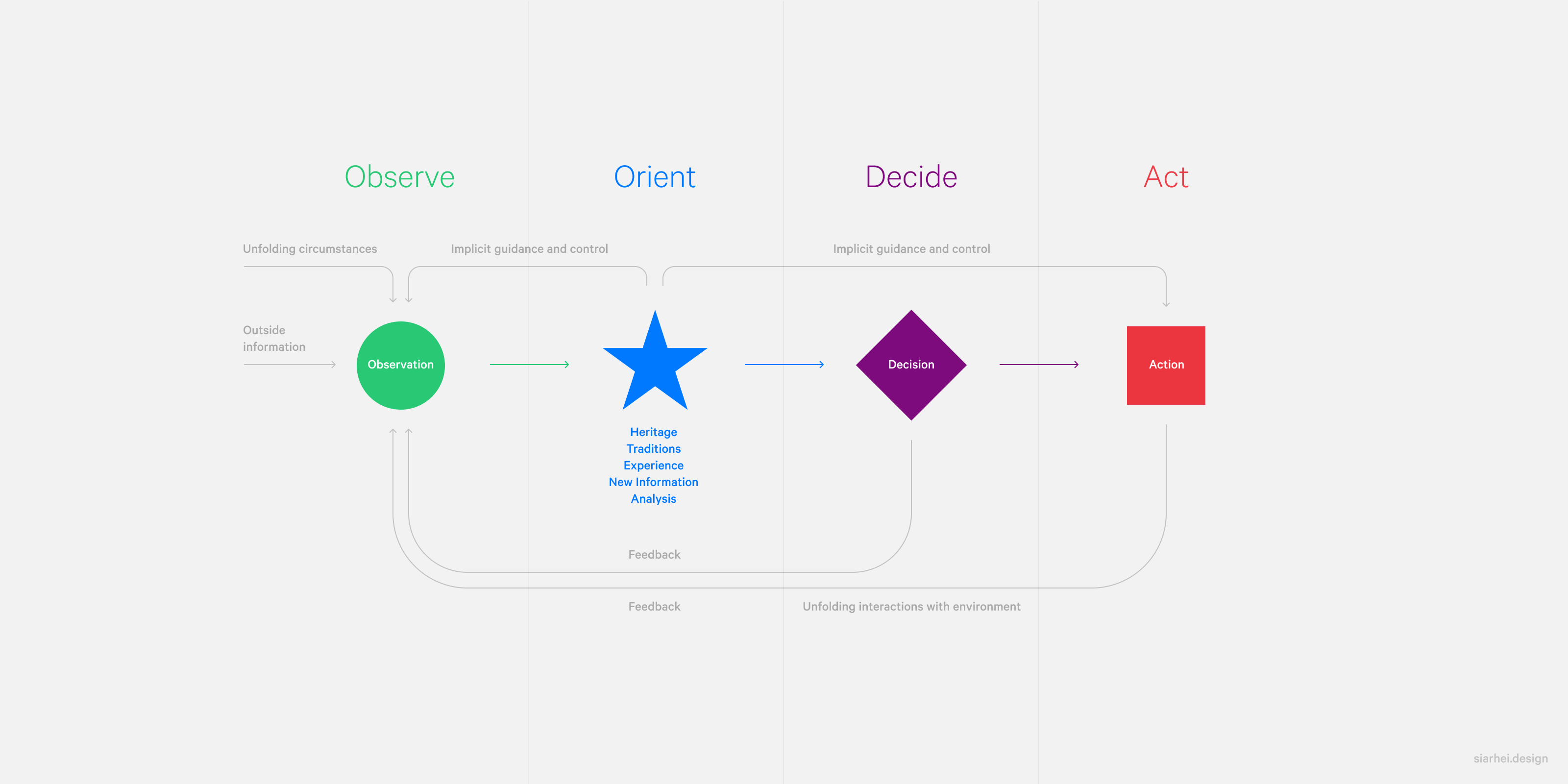
In fact, this idea goes far beyond just design process frameworks. For example, the OODA loop, used by the US Military for planning combat operations, also starts with initial stages of observing and orienting, as shown by the ‘OO’ in its name. No wonder—if you don’t understand the ‘terrain’, you can’t be effective in your mission.

While being curious is great, pairing it with a solid plan makes it even more powerful.

Surprisingly, or perhaps not, the same applies to designers. And yet, even designers who aren’t privy to these methodologies can be extremely successful at understanding their clients’ needs. How? The answer is simple: natural curiosity.

My career has been shaped by a persistent sense of curiosity. Each project I encounter is a journey into the unknown, a chance to navigate through varied industries, target audiences, business models, markets, platforms, and technologies. Being genuinely curious helps me contextualize every challenge, enrich my understanding of the problem, provide informed solutions, and effectively help my clients get to where they want to be.

While being curious is great, pairing it with a solid plan makes it even more powerful. Here are some activities that have proven effective in my previous projects, adding structure and focus to the exploration phase:

Activities
  • Client interviews
  • Developer interviews
  • User research
  • Competitor analysis
Outcomes
  • Insights
  • Opportunities
  • Personas
  • References

In essence, this phase involves getting to know the client’s environment, understanding their technology stack, gaining a clear picture of users, and examining the competitive landscape. The goal is to create detailed user personas, gather meaningful references, and discover valuable insights and opportunities. Completing this work with care sets the stage for what comes next: creativity.

Creativity

Once we understand the landscape, we are ready to dive into the design process. This is, arguably, where the fun truly begins. Intangible ideas start to transform into tangible graphical assets, and it feels as though meaningful progress is finally being made. The knowledge accumulated in the discovery stage serves as the foundation, informing us about constraints, limitations, and opportunities.

This part of the process is also the most detailed. It spans from scoping to sketching, wireframing, visual design, prototyping, and user testing. Each of these steps is crucial, and skipping any one of them could mean overlooking key aspects of the design.

Documenting
  • Objectives
  • Features
  • Deliverables
Sketching
  • User journeys
  • Flowcharts
Wireframing
  • Layout
  • Structure
  • Hierarchy
  • Messaging
Visual design
  • Brand alignment
  • User delight
  • Graphics
  • Typography
  • Color
  • Responsive layouts
  • Interactive states
  • Accessibility
Prototyping
  • Interactive prototype
User testing
  • Usability testing
  • A/B testing

Unlike polished visual designs, wireframes allow for quick and inexpensive changes. This step offers the freedom to experiment with layout, proportion, and hierarchy, laying the groundwork for strategic thinking about users and their priorities. It’s an opportunity to engage in one of the fundamental pillars of design thinking: employing empathy. To get to knowing the users, I try to step into their shoes and understand their goals and motivations. This approach can unlock a wealth of insights and opportunities, as proved yet again when redesigning the onboarding funnel for the cross-border recruitment agency Qbis.

In this project, instead of simply viewing candidates’ skills and work experience as valuable assets for paying customers (employers), we chose to assist the applicants themselves. We created a comprehensive suite of aids, tips, and services to support workers in their relocation, easing their transition to a new life and career abroad. This pivot did wonders for establishing a bond between the candidates and the Qbis brand, and it motivated them to be more enthusiastic about job offers. The changes implemented resulted in a threefold improvement in recruitment conversion rates, delivering benefits to all stakeholders: Qbis, employers, and candidates.

This experience serves as an example of how wireframing is more than assembling mockups—it’s a phase of brainstorming, thinking, and validating ideas that shape the entire product.

Creativity isn’t about pure artistic expression—it’s about informed, thoughtful execution of a vision.

As the project moves forward, the emphasis shifts from the rapid, experimental nature of wireframing to the more deliberate and detailed process of visual design. This phase demands greater intention and thoughtfulness. Decisions made during this phase are critical: How should the design align with the existing brand? Does the design language need to be elevated to feel more premium, or should it be toned down to appear more approachable? While some of these decisions may seem subtle and nuanced, the right choices resonate when they are in place. This phase encompasses everything from creating graphics, illustrations, and icons to selecting the fitting photography, typography, and color palette. Ultimately, the visual design should form a coherent system, with elements that complement and elevate one another. This systematic approach to design goes beyond aesthetics; it provides practical advantages for developers, offering them a predefined set of ready-to-use components.

Creating beautiful mockups may feel like the final step, but there’s more to be done. This includes creating clickable interactive prototypes for user testing, designing delightful animations, and crafting interactive components. These fine details may seem minor, but they can make all the difference.

Throughout this process, it is vital to continually validate the designs. From high-level concepts to polished and granular mockups, frequent feedback and user testing are crucial. This process, however, should be navigated with care. As tempting as it may be, we can’t put users in charge of the product. Instead, it is more effective to model realistic product usage scenarios or simply reveal mockups and ask test users to describe what they see. If they grasp the concept of the app and can successfully perform the intended tasks, the design is on the right track—if not, further revisions are necessary.

Creativity isn’t about pure artistic expression—it’s about informed, thoughtful execution of a vision. It’s a methodical journey that takes raw ideas and, through careful steps and collaboration, shapes them into a product that is user-friendly, visually coherent, and aligned with business goals.

Completion

When the design is finalized and all stakeholders have given their sign-off, it’s time to transition the files to the development team. The importance of a smooth and well-thought-out handoff process can’t be overestimated.

I’ve encountered numerous tales of live products that ended up looking nothing like the initial mockups. As designers, our goal is to ensure the final product always mirrors the original vision as closely as possible. This means more than just organizing files, colors, fonts, icons, states, resolutions, or creating detailed handoff documentation.

At its core, a seamless handoff is about nurturing a collaborative and transparent relationship between designers and developers. Developers shouldn’t find themselves making design decisions. They need direct and open communication with designers, a way to ask questions, request additional assets, and in certain circumstances, suggest adjustments.

A designer’s involvement doesn’t end with the handoff but extends into the Quality Assurance (QA) stage as well. QA teams excel in running automated tests and identifying functional issues, but the trained eye of a designer is irreplaceable when it comes to spotting subtle misalignments, incorrect spacing, or unintended font weights.

Design handoff can make or break your entire product. Simple steps, such as organizing files and components, establishing communication channels between designers and developers, and involving designers in the QA process, ensure smooth product delivery and perfect execution.

Calibration

When the product is finally built, tested, and launched, it may appear that the design process has reached its conclusion. However, as real users begin to engage with the product and provide their feedback, a new set of design challenges unfolds.

Observing how users interact with the product in real-world scenarios provides a lot of insights. It allows us to assess whether our initial hypotheses were accurate, shedding light on the aspects of the design that are spot on, as well as those that need refinement. This is where we can double down on our successes and address the shortcomings with confidence. Analytics—whether they focus on user pathways, time spent on different sections of the app, or feedback submitted through surveys—serve as precise tools for identifying opportunities for enhancement and improvement.

That’s the iterative nature of design—it’s not solely about building and launching. It’s about learning, adapting, and using these findings to guide the product toward continual refinement and sustained growth.

Let’s design your product together

Send me a message at [email protected], and we’ll set it in motion.